Monday, March 30, 2015

Testing

I tested on four individuals. Two male and two female. Below are the names and ages of the test subject and their thoughts on the projects. 


First I allowed the test subjects to view the poster by itself. After asking the first three questions I showed the subjects my first options: Footprints leading to the poster and a pamphlet. Both provide information about reducing a carbon foodprint.

After the viewer was exposed to the information behind the poster I showed them my next three options: a scale in a grocery store, shopping paper bag that provided information on what to buy and a shopping cart with information on what to buy. 


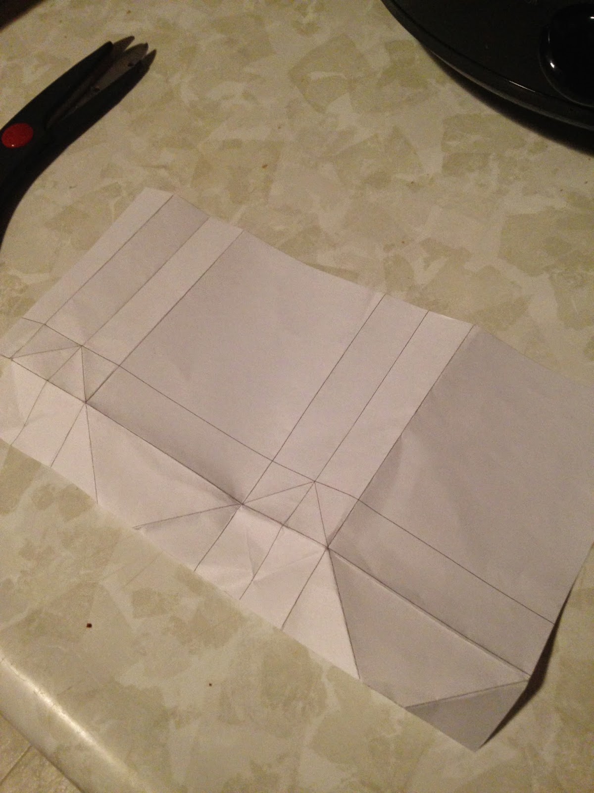
After my testing I have decided to use the Footprints and Paperbag as my two articles. 

Wednesday, March 25, 2015

More Process Second Piece

Here is a quick concept mock up on what the grocery bag would have designed on it. I wanted the sides of the bags to have a velum or see though window where shoppers purchases would be exposed. With information that informed them of what a foodprint is and what to shop for to reduce it. 


After the quick mock up, I took apart a real paper bag to measure it exact. Below is the small scale version of the what the bag would look like completely finished. 


First Go at Rice Krispies

 I did some quick sketches and layout on the computer to layout the front of the box for starters. Placement I feel will become very important. We are giving a lot of content that needs to be placed on this rather small box. I want to incorporate organization but bring fun elements into the box such as over-exaggerating on the barcode or the title. Color obviously will be incorporated but this was just a start. 


Tuesday, March 24, 2015

David Carson Ted Talk Reflection

David Carson is a well known unconventional designer. He is known for his work in the magazine Raygun. He does not follow the rules when creating a layout. He refuses to use the grid, which bothers some designers, however I feel it makes his work more interesting and stands apart from the rest. 

During Carson's TedTalk he explains how emotion should always go into design work as well as setting a goal for the viewer to have an emotional feeling. 

I believe Carson really get's his point across to his design style is when he shows this image:

He expresses how in school designers are taught if you can't read it is not design. He feels that if the work demonstrates and presents the message the right way no matter if it is legible or not it can still be good design. "What is the message sent, before the viewer dives into the material."


Friday, March 13, 2015

Piece 2: Sketches, Quick Mockups and Grid Collaboration


Below is a very simple photoshop rendition of what my second piece might be. I want to encourage people in grocery stores to think twice about what they are putting in their shopping bag/cart. 


Wednesday, March 11, 2015

Piece 1: Sketches, Quick mock ups & Grid collaboration


I know basically which piece I want to go with for the first piece. I think footprints that lead to the poster would be informational and let the viewer know about the poster before they actually see it.