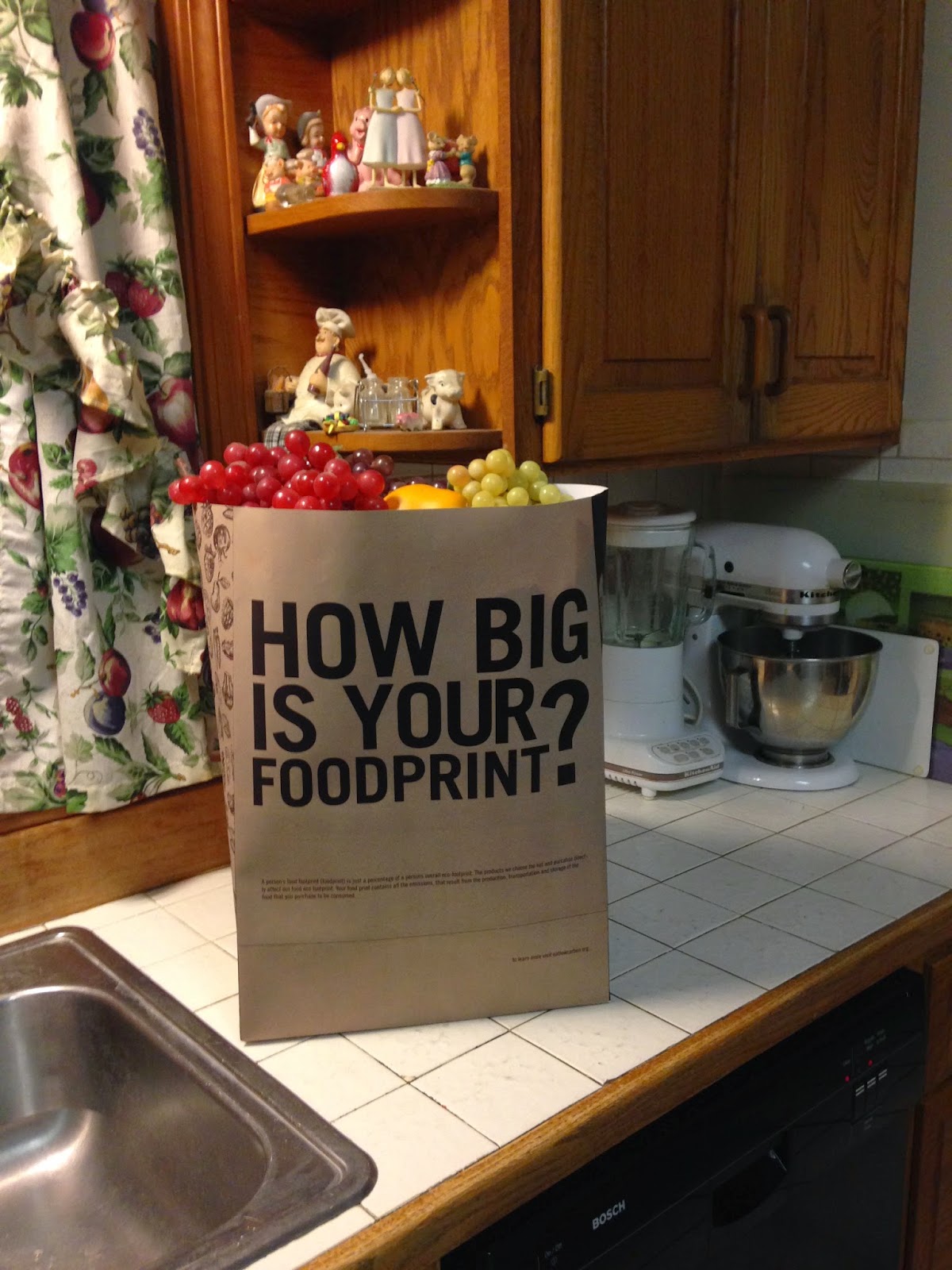
Piece 2: Grocery Bag that informs shoppers about what to buy while they are in the act of selecting food items in a grocery store. For my second piece I wanted to hold those who are directly in the act of buying, to a higher standard. I wanted them to feel that the information and directions of how to make a change was literally in their hands. Guilt is what I wanted to bring to the table, since it affects so many decisions in peoples lives. Would a shopper actually change their grocery list if they knew the products they were buying were bad for our environment? I would hope so.
Project Statement: I deepened the audiences understanding of "Happy Meal" by Gustavo Morainslie by creating factual foodprint and an informational grocery bag. With the factual foodprints I wanted to make it very clear what the object of the poster was: which is being self aware of the choices you make while selecting the food you eat/purchase - but not just in a health conscious, to fully understand the stresses of the process it takes to grow, harvest, transport and sell food. I feel by informing the audience of what a foodprint is before they view the poster is a big deal. I feel majority of the audience would glance at the poster and think "It's just another health conscious image". I wanted to start the viewer on the path with a question: "How big is your foodprint?" and in them with the same question after they obtain information: "So, How big is your foodprint?" I also provided a link of information the viewer could take a photo of to check out after they leave the exhibit to provide more information.
When selecting a piece two I knew I wanted to call to action for the viewers and still reflect on the poster. I felt that a grocery bag would inform shoppers while they are in the grocery store. I wanted them to be informed while making their food selections. On the bag the viewer is questioned "How big is your foodprint?" below the question is information on what exactly a "foodprint" is. On the side of the bags is a pattern of fruits and vegetables- since if purchased in season they usually reduce foodprints. On the back of the bag the view is given information on what to purchase and what not to purchase. Holding the shopper to a higher standard was a concentration for me.
The two objects correspond together in the sense that they could be used interchangeably. Some questions that came about were "Could the footprints be used in a grocery store?","What if the bag was next to the poster, would viewer still understand the concept?" "Could the bag and footprints work together?" I feel all three questions could be answered Yes! I feel both pieces inform enough to stand on their own, but together they still create a very strong piece that is not redundant with duplicate information.


No comments:
Post a Comment