Monday, November 2, 2015

Graphic Design Mood Board: Neutrals/Muted Colors

The graphic design group created three different mood boards between the seven of us.

 Grace and I worked together to compile our mood board, which was neutrals, muted colors with pops of color for call out on information. 

The following is some images we used as examples of the look and feel of what the room could be:


Here is our final mood board and our presentation slides:


Mood Board


Notes and Ideas to fill in the room

Notes and Ideas of Interactions


My added reserach: Understanding Poverty

Anna-Therese, Caroline and I were partnered in a group to tackle the topic of "What does it mean to live in Poverty?" Which we condensed to Understanding Poverty for our presentation. The following is information I came up with in order to challenge Ethos and Pathos of our viewers within our content group.


Tuesday, April 21, 2015

Interiro and Exterior Exploration

 I want the space to be colorful and look as if it belongs in down town KC while keeping a very jazz and homey feel. I want to incorporate floor graphics and add in a wall as I progress. Here are some starting designs just to get some ideas laid out.


Monday, April 20, 2015

BeBop Exhibit

Intent: Designing this exhibit I will strive to represent how BeBop sounds with images. Obviously I want to include the life and impact Charlie Parker brought to this new style of jazz. I want viewers of this exhibit to be intrigued by the colors and feel as if they stepped into a bebop song while traveling through this exhibit.

Photos for consideration:


Monday, April 13, 2015

Final Boxes

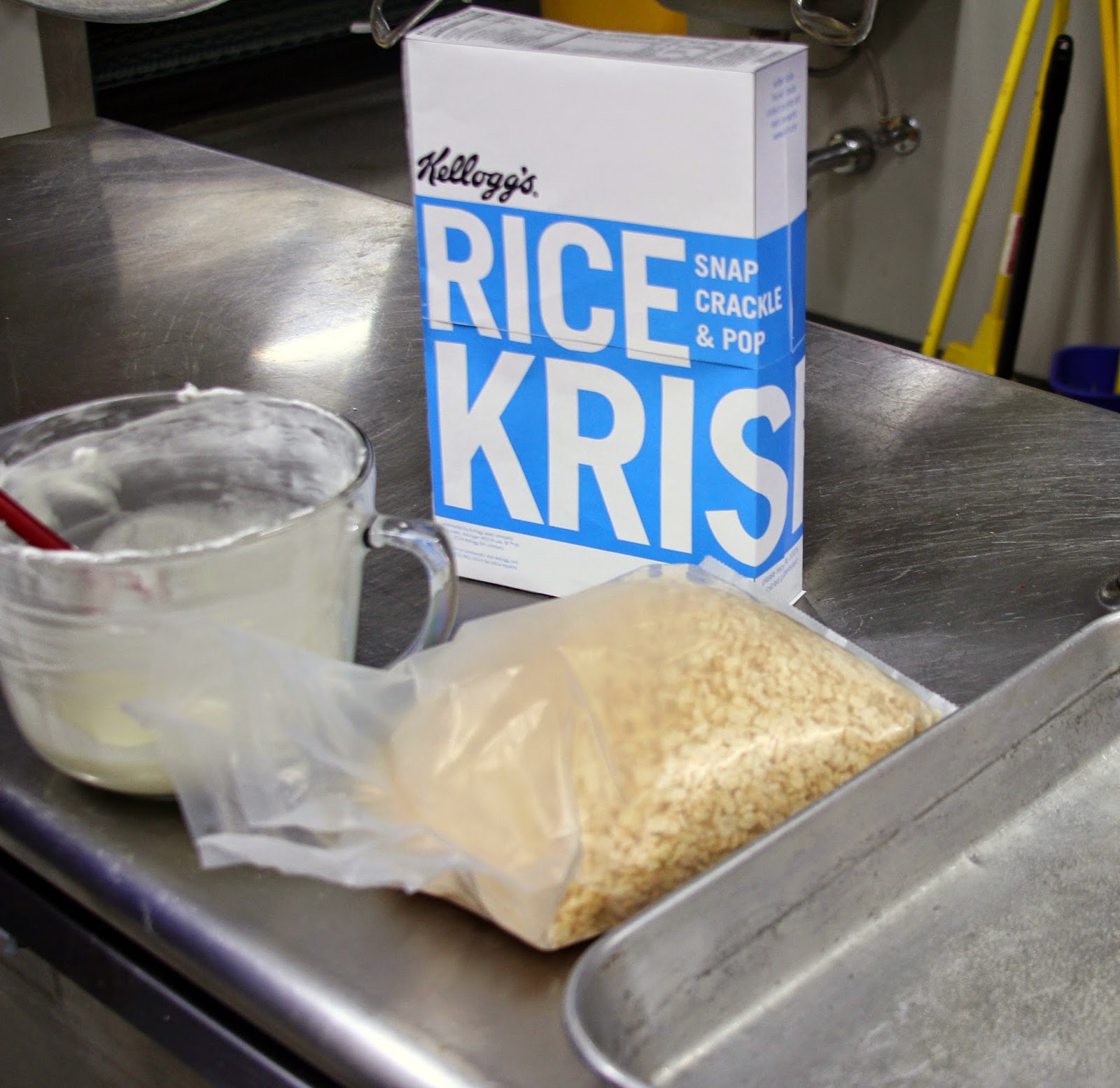
 This specific box is to represent order. The communication of this piece expresses order by the organization of information. The use of blue, black and white colors was to keep the box "krisp"and clean. Hierarchy is represented with the various sizes of text and also written in blue. I kept everything flushed left to keep unity throughout each side of the box. 


detailed abstract shot of box 1
 For my second box, I wanted to represent comfort. I used a subtle/undertoned/ relaxing sage green and clean whit hand lettering to give the box a "homey" feel. Keeping the box unified throughout was something I kept in mind. I wanted handlettering on the front but I wanted to make it differnet from my other box by not using the RICE KRISPIES name only on the front so I pulled from the other information. Using handlettering and a comfortable serif, with the addition of the calming sage green I feel this box represent comfort very nicely. 


detailed abstract shot of box 2
 For my third and final box, I believe it is pretty clear that this box represents energy. I used contrast between the red and the indigo to make the red very vibrant. I also used contrast with the hand lettering and typeface of choice. Behind the content is the barcode: which can be scanned at any angle on the box. Content of this box is highlighted between two bright red rectangle on either side of the box which guides the viewers eyes into the middle of the box. From every angle this box is bright, vibrant and exhumes energy. 


detailed shot of box 3


Wednesday, April 8, 2015

Photos

 Here are a few of my mock up "cereal boxes" in there environment. 


Sunday, April 5, 2015

Final Pieces and Project Statement


 Piece 1: Footprints that inform viewers about the information pertaining to the issue before they view the poster. Every other footstep has a fact that helps the viewer understand the concept of the poster more clearly. At the end of the prints the viewer would look at the poster and look at their feet that provides a question/call to action: "So, How big is your foodprint?" With the information provided in previous steps the viewer would understand the issue. There is a link on the last footprint that would send them to a website with more information on how to reduce ones "foodprint".


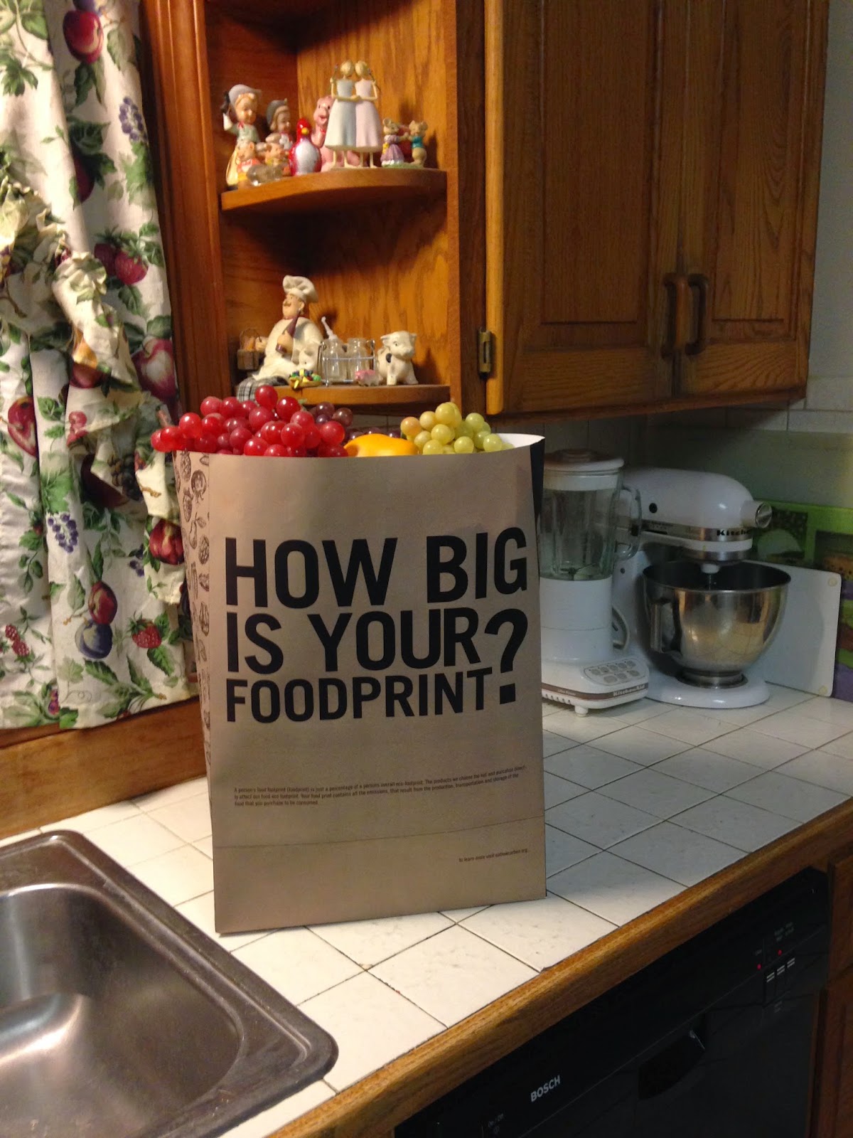
Piece 2: Grocery Bag that informs shoppers about what to buy while they are in the act of selecting food items in a grocery store. For my second piece I wanted to hold those who are directly in the act of buying, to a higher standard. I wanted them to feel that the information and directions of how to make a change was literally in their hands. Guilt is what I wanted to bring to the table, since it affects so many decisions in peoples lives. Would a shopper actually change their grocery list if they knew the products they were buying were bad for our environment? I would hope so.


Project Statement: I deepened the audiences understanding of "Happy Meal" by Gustavo Morainslie by creating factual foodprint and an informational grocery bag. With the factual foodprints I wanted to make it very clear what the object of the poster was: which is being self aware of the choices you make while selecting the food you eat/purchase - but not just in a health conscious, to fully understand the stresses of the process it takes to grow, harvest, transport and sell food. I feel by informing the audience of what a foodprint is before they view the poster is a big deal. I feel majority of the audience would glance at the poster and think "It's just another health conscious image". I wanted to start the viewer on the path with a question: "How big is your foodprint?" and in them with the same question after they obtain information: "So, How big is your foodprint?" I also provided a link of information the viewer could take a photo of to check out after they leave the exhibit to provide more information. 

When selecting a piece two I knew I wanted to call to action for the viewers and still reflect on the poster. I felt that a grocery bag would inform shoppers while they are in the grocery store.  I wanted them to be informed while making their food selections. On the bag the viewer is questioned "How big is your foodprint?" below the question is information on what exactly a "foodprint" is. On the side of the bags is a pattern of fruits and vegetables- since if purchased in season they usually reduce foodprints. On the back of the bag the view is given information on what to purchase and what not to purchase. Holding the shopper to a higher standard was a concentration for me.

The two objects correspond together in the sense that they could be used interchangeably. Some questions that came about were "Could the footprints be used in a grocery store?","What if the bag was next to the poster, would viewer still understand the concept?" "Could the bag and footprints work together?" I feel all three questions could be answered Yes! I feel both pieces inform enough to stand on their own, but together they still create a very strong piece that is not redundant with duplicate information.